The City of Southaven has been developing a metropolitan wireless Internet Service Provider. The first areas were serviced by some kind of microwave service (more later). You had to be near one of the city's water towers. Then you had to have a special antenna and modem. A friend of ours had it and its bandwidth was around 512 Kbps. Pretty pitiful.
As I rode through my neighborhood recently, I saw this on a street light pole.
When I got home, I grabbed my laptop and went looking for new wireless networks. Nothing there.
Then last night, I tried again and there it was:
So you know what I did. Yep, connected to it. Don't worry. That laptop is running a firewall.
But I immediately got this:
I guessed that they were intercepting http and forcing some kind of logon so I went to my browser and got this:
It looks like they're using "NetNearU."
The homepage for MagnoliaWave says their price is $30/month and run at 1 Mbps. They also have daily access at $6.95 per day. They referred to their roaming partners so I hoped they had partnered with AT&T but no luck.
From the logos on the homepage it seems like the earlier solution was WaveRider from Vecima.
Sunday, March 30, 2008
Friday, March 21, 2008
Where's Vista
On the way home today I was listening to Security Now. Leo and Steve were answering a question about Windows 2000 and it wandered off to Vista adoption.
Here's what I got from sitemeter.com for benmoore.blogspot.com:
whereiveben.blogspot.com was practically the same distribution.
Where are the Windows 2000 users coming from? There are almost as many as Vista users. Are there still that many businesses running Windows 2000? All their employees must be reading my blogs!
It's kinda surprising that after more than a year, the adoption of Vista is still single digits percentage and less than 1/10th of XP.
I blogged about this 2 years ago. Go here and see what it looked like then.
Steve: ...are we over 50 percent adoption?That sent me off to go look at my blogs to see what they were seeing.
Leo: I think it's well less than half.
Here's what I got from sitemeter.com for benmoore.blogspot.com:
whereiveben.blogspot.com was practically the same distribution.
Where are the Windows 2000 users coming from? There are almost as many as Vista users. Are there still that many businesses running Windows 2000? All their employees must be reading my blogs!
It's kinda surprising that after more than a year, the adoption of Vista is still single digits percentage and less than 1/10th of XP.
I blogged about this 2 years ago. Go here and see what it looked like then.
Saturday, March 15, 2008
DVR External Storage
I've written a couple of posts on my switch to HD. They are here, here, here, and here.
So far, so good. Except...
The Scientific Atlanta 8300HD DVR doesn't really have much recording capacity. But it does have an eSATA port where you can attach an external drive.
I found a Seagate FreeAgent Pro with 750GB and eSATA attachment for $129.99 at ZipZoomfly.com. Sorry but it's gone back up now.
But don't be disappointed. It didn't work with the 8300HD.
I found this the hard way but that wasn't really necessary. I could have gone here and found a table of what works and what doesn't.
A quick scan of that showed that my FreeAgent Pro was never going to work. Equally as obvious was that the Vantec enclosures worked well.
newegg.com had the Vantec NST-360SU-BK for $29.99 + $7.15 shipping. Sorry but it's gone back up now too. It was delivered the next day.
My plan was to put the 750GB drive from the FreeAgent Pro in the Vantec enclosure. That wasn't as easy as it seemed but Google came to the rescue. I Googled "how to open a seagate freeagent pro" and got this as the first hit:
I put the drive in the Vantec case and plugged it into the 8300HD. My "Recording Space Used" went from 40% to 8%.
So far, so good. Except...
The Scientific Atlanta 8300HD DVR doesn't really have much recording capacity. But it does have an eSATA port where you can attach an external drive.
I found a Seagate FreeAgent Pro with 750GB and eSATA attachment for $129.99 at ZipZoomfly.com. Sorry but it's gone back up now.
But don't be disappointed. It didn't work with the 8300HD.
I found this the hard way but that wasn't really necessary. I could have gone here and found a table of what works and what doesn't.
A quick scan of that showed that my FreeAgent Pro was never going to work. Equally as obvious was that the Vantec enclosures worked well.
newegg.com had the Vantec NST-360SU-BK for $29.99 + $7.15 shipping. Sorry but it's gone back up now too. It was delivered the next day.
My plan was to put the 750GB drive from the FreeAgent Pro in the Vantec enclosure. That wasn't as easy as it seemed but Google came to the rescue. I Googled "how to open a seagate freeagent pro" and got this as the first hit:
- Remove the rubber feet
- remove the screws from where the rubber feet were.
- Remove the esata/usb base
- remove the lower plastic cover
- remove the tiny screws
- remove the metal shield
- remove the 3 base screws.
- stick a standard screw driver into the lower holes and twist. One side panel will move, one will not. The removeable panel is the one with the logo that lights up. If you are looking at the drive from the back where the ports are, the panel is on the left.
- Stick the screwdriver between the plastic of the panel that moves. this panel has 4 clips holding it on very tightly but it can be pryed off.
- Once the panel is open, unplug the drive and remove it. It is in a metal free floating cage. Remove the rubber covers to reveal the screws.
- Pry the two cage panels apart and the drive is free. There is no permanent damage to the case, so you should be able to mount another drive in it.
I put the drive in the Vantec case and plugged it into the 8300HD. My "Recording Space Used" went from 40% to 8%.
Saturday, March 08, 2008
Window Live Writer
As I mentioned in my previous post about Windows Live Mail, Microsoft's suite of "Windows Live" products includes two that I've played with: Mail and Writer.
Windows Live Writer is a blog authoring tool that I really wanted to work. I want to go further with my posts than I can with blogger's capability. Oh, well.
Here's an excerpt of what I created for my post on Windows Live Mail.
Looks pretty good doesn't it?
Writer give you the ability to do things that blogger won't. For example, you can create tables and wrap text around images.
But...
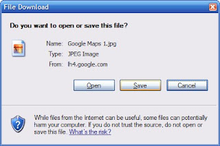
The pictures don't work! Try one. Here's what I get.
And I'm not the only one. Here are a couple of links to others having the same problem.
Windows Live Writer is a blog authoring tool that I really wanted to work. I want to go further with my posts than I can with blogger's capability. Oh, well.
Here's an excerpt of what I created for my post on Windows Live Mail.
Click on the "My Maps" tab and then "Create new map." You'll get the following screen:
Now, enter a title and description and click the radio button for Public or Unlisted. This doesn't matter for this project.
Back up above "Title" is a link for "Import." Click that.
Browse to your kml file for iGO POI Explorer and click on "Upload from File."
There it is!
To get fancy, click on "Link to this page" at the top right of the map.
Copy and paste that HTML to embed in your web page.
Ta da!
Looks pretty good doesn't it?
Writer give you the ability to do things that blogger won't. For example, you can create tables and wrap text around images.
But...
The pictures don't work! Try one. Here's what I get.
And I'm not the only one. Here are a couple of links to others having the same problem.
http://groups.msn.com/windowslivewriter/generaltopics.msnw?action=get_message&mview=0&ID_Message=5348Seems to be a problem with the way Writer saves the pictures for the blog. Hope they get it fixed or worked out with Google.
http://ktcatspost.blogspot.com/2008/01/creating-posts-with-windows-live.html
http://groups.msn.com/windowslivewriter/generaltopics.msnw?action=get_message&mview=0&ID_Message=5865&LastModified=4675647355351184717
Thursday, March 06, 2008
Maxthon 2
Maxthon has been my browser of choice for a couple of years. Recently I saw someone at work using Maxthon 2 so I thought I'd try it.
It had a couple of things that I wanted. The Address bar field has a yellow background when you're running SSL and a green background when the site has a valid EV certificate.
F10 will give you a side-by-side presentation. That's cool.
But ...
The Back and Forward buttons no longer have a drop-down menu. They've added a new History Track button that "combines" this function. That's a great alternative but don't take away my drop-downs! There is a post in the Maxthon 2 forums about this.
In Maxthon 1, I had the options set so that if you double-clicked on a blank space on the tab bar, it had a mini-script of "File -> New Tab -> Home" and left the Address Bar field with focus. You could just start typing! In Maxthon 2, "Double Click on Tab Bar" can give you "Homepage." The Address Bar field doesn't have focus. A moderator of the Maxthon 2 forums said "The 'new tab' is not configurable at the moment." That was in September 2007. Apparently there hasn't been much progress since then.
There are other differences with tabs. One user asked "Is there a way to make the tabs use in ver 2.x behave like ver 1.x in Maxthon...?" When the moderator responded with some threads that stated "it's not implemented" the poster noted that those posts didn't resolve the issue but thanked the moderator. A "Core User" flamed the poster and suggested that the poster "ought to apologize."
The search capability in Maxthon 2 is just different enough to be annoying. One poster asked how to get a similar search to Maxthon 1. A moderator responded:
One poster asked:
little lot more time.
It had a couple of things that I wanted. The Address bar field has a yellow background when you're running SSL and a green background when the site has a valid EV certificate.
F10 will give you a side-by-side presentation. That's cool.
But ...
The Back and Forward buttons no longer have a drop-down menu. They've added a new History Track button that "combines" this function. That's a great alternative but don't take away my drop-downs! There is a post in the Maxthon 2 forums about this.
I was wondering if it is possible yet to use the original back and forward buttons. I really dislike the catch all button that was implemented in M2 and would like to have the drop down list integrated with the button as before. It's cleaner and faster.The moderator responded:
It's not possibleMaxthon has a nice feature similar to Windows Explorer in that you can "go up" one level in the current URL. In Maxthon 2, this button has the words "Go Up" next to it and can't be configured. Gimme a break. I know what that icon represents. I want my real estate back.
In Maxthon 1, I had the options set so that if you double-clicked on a blank space on the tab bar, it had a mini-script of "File -> New Tab -> Home" and left the Address Bar field with focus. You could just start typing! In Maxthon 2, "Double Click on Tab Bar" can give you "Homepage." The Address Bar field doesn't have focus. A moderator of the Maxthon 2 forums said "The 'new tab' is not configurable at the moment." That was in September 2007. Apparently there hasn't been much progress since then.
There are other differences with tabs. One user asked "Is there a way to make the tabs use in ver 2.x behave like ver 1.x in Maxthon...?" When the moderator responded with some threads that stated "it's not implemented" the poster noted that those posts didn't resolve the issue but thanked the moderator. A "Core User" flamed the poster and suggested that the poster "ought to apologize."
The search capability in Maxthon 2 is just different enough to be annoying. One poster asked how to get a similar search to Maxthon 1. A moderator responded:
This information was also already available on the forum, so I suggest reading through the FAQ's and make searches for further questions.To which the poster responded:
...if you are going to further admonish me I don't need the answer.Ouch.
One poster asked:
I just updated to Maxthon 2 and generally speaking am very happy. The only problem is ... you seem to have dismantled the quick search options. ... am I missing something?The moderator's response:
Nope...Maxthon 2 (2.0.8.1720 UNICODE) has crashed twice while I've been researching this post. I think we ought to give Maxthon 2 a
Saturday, March 01, 2008
Windows Live Mail
Microsoft has a suite of "Windows Live" products. I've been playing with two of them: Mail and Writer. (Look at those links! http://get.live.com/ID0EDMAC for Writer. What gives?)
Mail replaces Outlook Express and Vista's Windows Mail. Wait, that's the same name. Well, almost. The new product is Windows Live Mail. There, that clears that up.
Mail has that Vista look. But look closely at that screen capture. I used Alt+PrtSc to capture that so I would just get the application in focus. Then why do you see my desktop behind it? Mail cheats. To get that Vista look, they apparently make the top menu transparent. If you look closely, it goes all the way around the window as well.
This little "beauty" trick is not benign. You can't put the application window up against the top of the screen. It'll jump back down a little due to the hidden area. And the menu items that you need are hidden and have to be unhidden to do routine activities, e.g. manage accounts.
The most aggravating part of Mail is the little nuances that just don't work "right." Things like Ctrl+C. This doesn't always copy the selected text. Seems simple enough to get right.
Another is that it doesn't scroll with the center button on my ThinkPads. It does work with a regular mouse's roller wheel.
The Options setting for "Send and receive messages at startup" works some of the time. C'mon Microsoft! See if this thread frustrates you as much as me.
And the toolbar reserves a significant part of real estate for the Windows Live Account id even if you aren't using one.
On the positive side, it integrates seamlessly with Hotmail orLive Mail (wait, this application is called Live Mail) live.com's mail.
Mail replaces Outlook Express and Vista's Windows Mail. Wait, that's the same name. Well, almost. The new product is Windows Live Mail. There, that clears that up.
Mail has that Vista look. But look closely at that screen capture. I used Alt+PrtSc to capture that so I would just get the application in focus. Then why do you see my desktop behind it? Mail cheats. To get that Vista look, they apparently make the top menu transparent. If you look closely, it goes all the way around the window as well.
This little "beauty" trick is not benign. You can't put the application window up against the top of the screen. It'll jump back down a little due to the hidden area. And the menu items that you need are hidden and have to be unhidden to do routine activities, e.g. manage accounts.
The most aggravating part of Mail is the little nuances that just don't work "right." Things like Ctrl+C. This doesn't always copy the selected text. Seems simple enough to get right.
Another is that it doesn't scroll with the center button on my ThinkPads. It does work with a regular mouse's roller wheel.
The Options setting for "Send and receive messages at startup" works some of the time. C'mon Microsoft! See if this thread frustrates you as much as me.
And the toolbar reserves a significant part of real estate for the Windows Live Account id even if you aren't using one.
On the positive side, it integrates seamlessly with Hotmail or
Subscribe to:
Posts (Atom)